Mini-Project #03: Do Proportional Electoral College Allocations Yield a More Representative Presidency?
Author: Timbila Nikiema
INTRODUCTION
The U.S. Electoral College system has long been a focal point of debate in American politics, with arguments that its structure may skew election results away from the popular vote. In Mini-Project #03, we dive into this discussion by investigating whether a proportional allocation of Electoral College votes could create a more representative presidential election outcome.
This project involves examining the existing Electoral College system, integrating data from various government and academic sources, and utilizing spatial data techniques to visualize and analyze election results. By exploring both historical and hypothetical election outcomes under different allocation methods, we aim to assess the representativeness of the presidency and consider how proportional allocation might alter the results.
Throughout this project, we will:
Integrate data from disparate sources and learn to work with spatial data formats.
Create numerous visualizations, including spatial and animated graphs, to effectively illustrate our findings.
Investigate both historical patterns and hypothetical scenarios to understand the potential impact of proportional Electoral College allocations.
The goal is not to produce a “correct” answer but to foster a thoughtful, data-driven exploration of Electoral College dynamics. We encourage respectful dialogue and constructive feedback during peer reviews, focusing on the quality of analysis, code, visualizations, and argumentation rather than on any political stance.
Data Acquisition
For our analysis, we will be using R, leveraging its powerful data manipulation and visualization capabilities. To ensure we have all the necessary tools, we will load the following libraries:
Code
library(tidyverse) # For data manipulation and visualizationlibrary(gganimate) # For creating plot animationlibrary(stringr) # For string operationslibrary(ggplot2) # For creating static visualizationslibrary(gifski) # For animated visualizationslibrary(dplyr) # For data wranglinglibrary(tidyr) # For tidying datalibrary(RCurl) # For downloading data from URLslibrary(httr) # For HTTP requestslibrary(zip) # For handling zip fileslibrary(sf) # For spatial data manipulationlibrary(DT) # For interactive data tables
Data I: US House and Presidential Election Votes from 1976 to 2022
We will begin our data setup by downloading two key datasets provided by the MIT Election Data Science Lab:[^1]: MIT Election Data + Science Lab. (n.d.). MIT Election Lab. MIT Election Data + Science Lab. https://electionlab.mit.edu/
The 1976-2020 US Presidential Elections dataset, covering presidential vote counts. These files can be accessed and downloaded directly through the provided links.
Data II: Congressional Boundary Files 1976 to 2012
The second key dataset we will need for our analysis includes Congressional Boundary shapefiles. These files provide spatial data for all U.S. congressional districts and are essential for visualizing and analyzing electoral data by district.
Congressional Boundaries (1789–2012): These shapefiles are available from Jeffrey B. Lewis, Brandon DeVine, Lincoln Pritcher, and Kenneth C. Martis and cover all U.S. congressional districts from 1789 to 2012. They can be downloaded from UCLA’s Congressional Districts project.
Code
# Task 1: congress shapefiles# Import congressional district data from 1976 to 2012get_cdmaps_file <-function(fname) { BASE_URL <-"https://cdmaps.polisci.ucla.edu/shp/" fname_ext <-paste0(fname, ".zip")if (!file.exists(fname_ext)) { FILE_URL <-paste0(BASE_URL, fname_ext)download.file(FILE_URL,destfile = fname_ext)}}# download shape files for 94th to 112th congressget_cdmaps_file("districts112")get_cdmaps_file("districts111")get_cdmaps_file("districts110")get_cdmaps_file("districts109")get_cdmaps_file("districts108")get_cdmaps_file("districts107")get_cdmaps_file("districts106")get_cdmaps_file("districts105")get_cdmaps_file("districts104")get_cdmaps_file("districts103")get_cdmaps_file("districts102")get_cdmaps_file("districts101")get_cdmaps_file("districts100")get_cdmaps_file("districts099")get_cdmaps_file("districts098")get_cdmaps_file("districts097")get_cdmaps_file("districts096")get_cdmaps_file("districts095")get_cdmaps_file("districts094")
Congressional Boundaries (2014–present): For more recent boundaries, we will use the shapefiles provided by the U.S. Census Bureau, which include congressional districts from 2014 to the present. These can be accessed at the U.S. Census Bureau’s TIGER/Line files site.
Code
# Task 2# Import data from US Census 113th to 116thif (!file.exists("districts113.zip")) {download.file("https://www2.census.gov/geo/tiger/TIGER2013/CD/tl_2013_us_cd113.zip", destfile ="districts113.zip")}if (!file.exists("districts114.zip")) {download.file("https://www2.census.gov/geo/tiger/TIGER2014/CD/tl_2014_us_cd114.zip", destfile ="districts114.zip")}if (!file.exists("districts115.zip")) {download.file("https://www2.census.gov/geo/tiger/TIGER2016/CD/tl_2016_us_cd115.zip", destfile ="districts115.zip")}if (!file.exists("districts116.zip")) {download.file("https://www2.census.gov/geo/tiger/TIGER2018/CD/tl_2018_us_cd116.zip", destfile ="districts116.zip")}if (!file.exists("tl_2020_us_state.zip")) {download.file("https://www2.census.gov/geo/tiger/TIGER2020/STATE/tl_2020_us_state.zip", destfile ="us_states_shapes.zip")}
These spatial datasets are crucial for accurate mapping and analysis of congressional district boundaries over time.
Initial Exploration of Vote Count Data
In this section, we explore the vote count data from the MIT Election Data Science Lab to answer several key questions about electoral trends in the US. This includes analyzing changes in House seats, the impact of New York’s “fusion” voting system, and comparing presidential and congressional vote patterns.
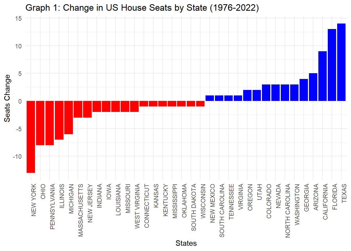
Which states have gained and lost the most seats in the US House of Representatives between 1976 and 2022?
Code
# Find the number of seats in 1976 and 2022 for each stateseat_count <- HOUSE_DATA |>filter(year %in%c(1976, 2022)) |>group_by(year, state) |>summarise(total_seats =n_distinct(district)) |>select(year, state, total_seats)seats_1976 <- seat_count |>filter(year ==1976) |>select(state, seats_1976 = total_seats)seats_2022 <- seat_count |>filter(year ==2022) |>select(state, seats_2022 = total_seats)# Find the change in seats from 1976 to 2022seat_change <- seats_1976 |>inner_join(seats_2022, by ="state") |>mutate(seat_change = seats_2022 - seats_1976) |>filter(seat_change !=0)|># Drop states with no change in seatsselect(-year.y) |># Drop the second "year" column by using -year.yarrange(desc(seat_change))# Visual representation: Graph 1ggplot(seat_change, aes(x =reorder(state, seat_change), y = seat_change, fill = seat_change >0)) +geom_bar(stat ="identity", show.legend =FALSE) +labs(title ="Graph 1: Change in US House Seats by State (1976-2022)",x ="States",y ="Seats Change") +scale_fill_manual(values =c("red", "blue"), labels =c("Lost Seats", "Gained Seats")) +theme_minimal() +theme(axis.text.x =element_text(angle =90, hjust =1))
Code
# Display data table for seat changedatatable(setNames(seat_change, c("Year", "State", "Seats 1976", "Seats 2022", "Seat Change")),options =list(pageLength =10, autoWidth =TRUE),caption ="Table 1: Change in seats in the US House of Representatives between 1976 and 2022")
This analysis highlights the states that saw increases or decreases in their House representation over this period. States with significant population growth, such as Texas and Florida, gained over 27 seats collectively, reflecting substantial increases in representation. Conversely, states with slower growth or population decline saw reductions in their House seats, indicating regional demographic shifts impacting representation.
Are there any elections in our data where the election would have had a different outcome if the “fusion” system was not used and candidates only received the votes their received from their “major party line” (Democrat or Republican) and not their total number of votes across all lines?
Code
# clean up: exclude "writein" candidates, "blank" candidates, and NA in party fieldelection <- HOUSE_DATA |>filter(!grepl("blank", candidate, ignore.case =TRUE), # Exclude candidates with "blank" in their name candidate !="writein", # Exclude rows with candidate listed as "writein"!is.na(party)) # Exclude rows where party is NA# Identify fusion candidates: those with more than one party in the same electionfusion_candidates <- election |>group_by(year, state, state_po, candidate) |>summarise(total_votes =sum(candidatevotes), # total votes across all linesparty_votes =sum(candidatevotes[party %in%c("DEMOCRAT", "REPUBLICAN")]),.groups ="drop"# remove grouping after summarizing ) |>filter(n() >1) # Only keep candidates with multiple party lines# Determine if excluding fusion votes changes the outcomeoutcome_change <- fusion_candidates |>group_by(year, state, state_po) |>mutate(winner_with_fusion = candidate[which.max(total_votes)],winner_without_fusion = candidate[which.max(party_votes)],outcome_changed = winner_with_fusion != winner_without_fusion ) |>ungroup() # ungroup after mutate for clean output# Display elections where outcome changes without the fusion votingresult_table <- outcome_change |>filter(outcome_changed) |>select(year, state, state_po, winner_with_fusion, winner_without_fusion, outcome_changed) |>distinct()# Format the table to display 10 rows with the caption at the bottomdatatable(result_table,options =list(pageLength =10, autoWidth =TRUE, captionSide ="bottom"),caption ="Table 2: Election Fusion Winners (Excluding Write-in, Blank Candidates, and NA in Party Field)") |>formatStyle(columns =names(result_table), fontSize ='100%')
This table shows the historical elections for which the outcome would have been different had not been for the fusion voting system.
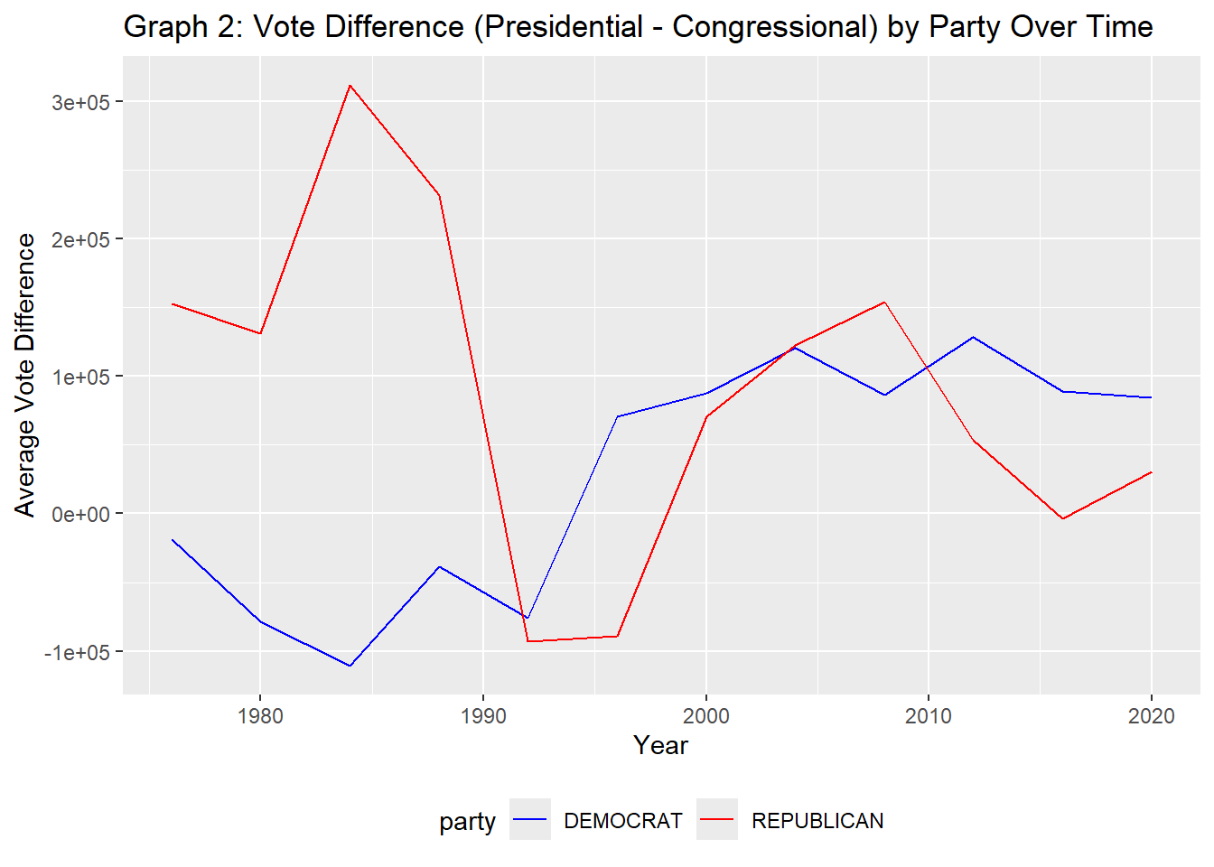
Do presidential candidates tend to run ahead of or run behind congressional candidates in the same state? That is, does a Democratic candidate for president tend to get more votes in a given state than all Democratic congressional candidates in the same state?
Does this trend differ over time? Does it differ across states or across parties? Are any presidents particularly more or less popular than their co-partisans?
Code
# Aggregate Congressional votescongress_votes <- HOUSE_DATA |>group_by(year, state, party) |>summarise(congress_votes =sum(candidatevotes), .groups ="drop")# Aggregate Presidential votespresident_votes <- PRESIDENT_DATA |>group_by(year, state, party_detailed) |>summarise(president_votes =sum(candidatevotes), .groups ="drop") |>rename("party"="party_detailed")# Congress and Presidential data merged and vote difference calculationvote_difference <- congress_votes |>inner_join(president_votes, by =c("year", "state", "party")) |>mutate(vote_difference = president_votes - congress_votes) |>select(-president_votes, -congress_votes)# Democrat and Republican vote dataselected_parties <- vote_difference |>filter(party %in%c("DEMOCRAT", "REPUBLICAN")) |>group_by(year, party) |>summarise(avg_vote_diff =mean(vote_difference))# Display the results in a datatabletabledata <- vote_difference |>filter(party %in%c("DEMOCRAT", "REPUBLICAN")) |>select(state, party,vote_difference)datatable(setNames(tabledata, c("State", "Party", "Vote Difference")),options =list(pageLength =10, autoWidth =TRUE),caption ="Table 3: Presidential Votes vs Congress Votes") |>formatRound(columns ="Vote Difference", digits =0)
Code
# Plot average vote difference by year and partyggplot(selected_parties, aes(x = year, y = avg_vote_diff, color = party)) +geom_line() +scale_color_manual(values =c("DEMOCRAT"="blue", "REPUBLICAN"="red")) +labs(title ="Graph 2: Vote Difference (Presidential - Congressional) by Party Over Time",x ="Year", y ="Average Vote Difference") +theme_minimal() |>theme(legend.position ="bottom")
The table and graph above show the vote difference between presidential and congressional candidates across various states, broken down by party. Presidential candidates’ performance does not always align with their party’s performance in congressional races. In some cases, the presidential candidates outperform their congressional counterparts, while in others, it’s the reverse. The vote differences can vary significantly across states and parties, indicating that voter preferences for presidential and congressional candidates can be quite different.
From the district file downloaded earlier, we will need to read and extract the shape files for further analysis of the 2000 presidential elections.
Code
zip_file <-"districts106.zip"# Extract the contents of the zip filesunzip(zip_file)# Read the 106th district shape fileshapefile_106 <-st_read(file.path("districtShapes/districts106.shp"))
Reading layer `districts106' from data source
  `C:\Users\Timbila Nikiema\OneDrive\Documents\STA9750-2024-FALL\districtShapes\districts106.shp'
  using driver `ESRI Shapefile'
Simple feature collection with 436 features and 15 fields (with 1 geometry empty)
Geometry type: MULTIPOLYGON
Dimension:     XY
Bounding box:  xmin: -179.1473 ymin: 18.9177 xmax: 179.7785 ymax: 71.35256
Geodetic CRS:  GRS 1980(IUGG, 1980)
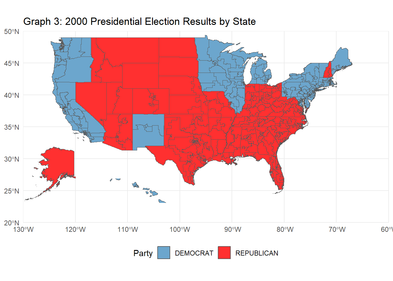
The following R code creates a choropleth map visualizing the 2000 U.S. presidential election results by state. Using election data joined with U.S. state geometries, the map displays each state colored by the winning party (Republican or Democratic). Insets for Alaska and Hawaii are added for clarity, and each state is labeled with its two-letter postal abbreviation for easier identification. This visualization provides a clear, geographic perspective of the electoral outcomes across the contiguous United States, with separate, scaled-down views of Alaska and Hawaii.
Code
# Task 5: Chloropleth Visualization of the 2000 Presidential Election Electoral College Results# 2000 elections dataelections_2000 <- PRESIDENT_DATA |>filter(year ==2000) |>group_by(state, party_simplified) |>summarize(total_votes =sum(candidatevotes), .groups ="drop") |>group_by(state) |>slice_max(total_votes, n =1) |>ungroup() |>select(state, party_simplified) |>rename(Party = party_simplified)# join the shape file to election resultsshapefile_us_2000 <- shapefile_106 |>mutate(STATENAME =toupper(trimws(STATENAME))) |>left_join(elections_2000, join_by(STATENAME == state))# create Choropleth of contiguous US firstconsolidated_map <-ggplot(shapefile_us_2000, aes(geometry = geometry, fill = Party), color ="black") +geom_sf() +scale_fill_manual(values =c("DEMOCRAT"="skyblue3", "REPUBLICAN"="firebrick1")) +theme_minimal() +labs(title ="Graph 3: 2000 Presidential Election Results by State", fill ="Party") +theme(legend.position ="bottom") +coord_sf(xlim =c(-130, -60), ylim =c(20, 50), expand =FALSE)# Alaska insetalaska_sf <- shapefile_us_2000[shapefile_us_2000$STATENAME =="ALASKA", ]inset_alaska <-ggplot(alaska_sf,aes(geometry = geometry, fill = Party), color ="black") +geom_sf() +scale_fill_manual(values =c("DEMOCRAT"="skyblue3", "REPUBLICAN"="firebrick1")) +theme_void() +theme(legend.position ="none") +coord_sf(xlim =c(-180, -140), ylim =c(50, 72), expand =FALSE)# Hawaii insethawaii_sf <- shapefile_us_2000[shapefile_us_2000$STATENAME =="HAWAII", ]inset_hawaii <-ggplot(hawaii_sf, aes(geometry = geometry, fill = Party), color ="black") +geom_sf() +scale_fill_manual(values =c("DEMOCRAT"="skyblue3", "REPUBLICAN"="firebrick1")) +theme_void() +theme(legend.position ="none") +coord_sf(xlim =c(-161, -154), ylim =c(20, 22), expand =FALSE)combined_map <- consolidated_map +annotation_custom(ggplotGrob(inset_alaska),xmin =-120, xmax =-130, # Adjust position for Alaskaymin =15, ymax =40) +annotation_custom(ggplotGrob(inset_hawaii),xmin =-115, xmax =-100, # Adjust position for Hawaiiymin =20, ymax =30) # Adjust these values to fit# Print the combined mapprint(combined_map)
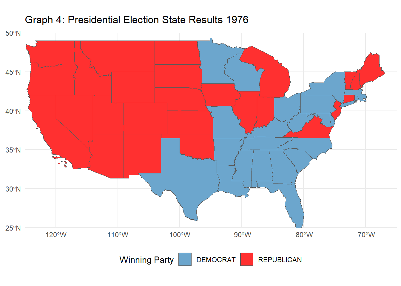
# Task 6: Advanced Chloropleth Visualization of Electoral College Results# Modify your previous code to make an animated version showing election results over time.# List of election yearselection_years <-c(1976, 1980, 1984, 1988, 1992, 1996, 2000, 2004, 2008, 2012, 2016, 2020)# Function to process election results for a specific yearwinner_by_year <-function(input_year) { PRESIDENT_DATA |>filter(year == input_year) |># Filter for the specific yeargroup_by(state, party_simplified) |>summarize(total_votes =sum(candidatevotes), .groups ="drop") |>group_by(state) |>slice_max(total_votes, n =1) |>ungroup() |>select(state, party_simplified) |>rename(winning_party = party_simplified) |>mutate(year = input_year) # Add year to the table}# Combine each year's results into one data tableelection_results <-bind_rows(lapply(election_years, winner_by_year))# Load the state shape filesstates_shapes <-st_read("tl_2020_us_state.shp") |>mutate(STATE =toupper(trimws(NAME)))
Reading layer `tl_2020_us_state' from data source
  `C:\Users\Timbila Nikiema\OneDrive\Documents\STA9750-2024-FALL\tl_2020_us_state.shp'
  using driver `ESRI Shapefile'
Simple feature collection with 56 features and 14 fields
Geometry type: MULTIPOLYGON
Dimension:     XY
Bounding box:  xmin: -179.2311 ymin: -14.60181 xmax: 179.8597 ymax: 71.43979
Geodetic CRS:  NAD83
Code
# Exclude Alaska and Hawaiistates_shapes <- states_shapes |>filter(!STATE %in%c("ALASKA", "HAWAII"))# Join the election data with the shapefile for all yearselection_results <- states_shapes |>left_join(election_results |>mutate(state =toupper(trimws(state))), by =c("STATE"="state")) |>filter(!is.na(year)) # Excluding any NAs# Create the animated plotanimate_election_results <-ggplot(election_results, aes(geometry = geometry, fill = winning_party), color ="black") +geom_sf() +scale_fill_manual(values =c("DEMOCRAT"="skyblue3", "REPUBLICAN"="firebrick1")) +theme_minimal() +labs(title ="Graph 4: Presidential Election State Results {closest_state}", fill ="Winning Party") +theme(legend.position ="bottom") +transition_states(year, transition_length =0, state_length =1) +coord_sf(xlim =c(-125, -65), ylim =c(25, 50), expand =FALSE) # Exclude Alaska and Hawaii# Print the animated graphanimate(animate_election_results, fps =10)
Comparing the Effects of ECV Allocation Rules
To evaluate the fairness and effects of different Electoral College Vote (ECV) allocation schemes, we’ll walk through a series of steps for each allocation mentioned strategies. The analysis will include comparing each allocation scheme’s results against the historical winners to uncover any systematic biases, and then assessing which scheme is “fairest” in terms of how it impacts election outcomes.
State-Wide Winner-Take-All (WTA)
The candidate with the most votes in the state wins all the state’s electoral votes.
Code
# Electoral college countelectoral_count <- HOUSE_DATA |>group_by(year, state) |>summarise(reps_count =n_distinct(district)) |>mutate(electoral_votes = reps_count +2) |>select(year, state, electoral_votes)# find the candidate with the most votes each year in each statestate_wide_winner_take_all <- PRESIDENT_DATA |>group_by(year, state, candidate) |>summarize(total_votes =sum(candidatevotes), .groups ="drop") |>group_by(year, state) |>slice_max(order_by = total_votes, n =1, with_ties =FALSE) |># find the winner of each state based on total votesrename(winner = candidate) # rename for conventional understanding# join the state, winner, and number of electoral votes & sum which candidate that gets the most electoral votesstate_wide_winner_take_all <- state_wide_winner_take_all |>left_join(electoral_count,by =c("year", "state")) |>group_by(year, winner) |>summarize(total_electoral_votes =sum(electoral_votes)) |># sum electoral votes across all states by candidate each yearslice_max(order_by = total_electoral_votes, n =1, with_ties =FALSE)
The WTA method tends to exaggerate the margin of victory for the winning candidate, disproportionately amplifying the impact of swing states. It can produce outcomes that diverge significantly from the national popular vote. For example: * 2000 Election: George W. Bush won the presidency with 271 ECVs to Al Gore’s 266, despite losing the popular vote. * 2016 Election: Donald Trump won the presidency with 305 ECVs to Hillary Clinton’s 227, again losing the popular vote.
States like Maine and Nebraska use this system, where electors are assigned both based on the winners of each congressional district (district-level WTA) and a set of electors awarded to the winner of the statewide vote. This is a hybrid of district-level and state-wide allocation.
Code
# find number of districts each party won to represent electoral votes won in each statedistrict_winner <- HOUSE_DATA |>group_by(year, state, district) |>slice_max(order_by = candidatevotes, n =1, with_ties =FALSE) |>select(year, state, district, party) |>group_by(year, state, party) |>summarize(districts_won =n()) # number of electoral votes received by each party# find popular vote winner in the stateat_large_winner <- HOUSE_DATA |>group_by(year, state) |>slice_max(order_by = candidatevotes, n =1, with_ties =FALSE) |>select(year, state, party) |>add_column(at_large_votes =2) # designating the vote count# join tables together to find total electoral votes the presidential party receives in each statedistrict_wide_winner_take_all <- district_winner |>left_join(at_large_winner, by =c("year", "state", "party")) |>mutate(across(where(is.numeric), ~ifelse(is.na(.), 0, .))) |>mutate(total_electoral_votes = districts_won + at_large_votes) |>select(-districts_won, -at_large_votes) |>rename(party_simplified = party) |># rename for easier joining conventionleft_join(PRESIDENT_DATA, by =c("year", "state", "party_simplified")) |># join to presidential candidateselect(year, state, total_electoral_votes, candidate) |>group_by(year, candidate) |>summarize(electoral_votes =sum(total_electoral_votes)) |>slice_max(order_by = electoral_votes, n =1, with_ties =FALSE) |>drop_na() # get rid of the non-presidential election years
This scheme introduces more granularity but can still deviate significantly from the popular vote due to district-level gerrymandering. In elections like 2012, Barack Obama won both Maine’s districts and the state, earning all its ECVs. In 2020, Nebraska awarded some ECVs to Joe Biden while awarding most to Donald Trump.
State-Wide Proportional Allocation
The state’s electoral votes are distributed proportionally based on the percentage of the popular vote each candidate receives. For example, if a candidate wins 40% of the vote in a state with 10 ECVs, they get 4 ECVs.
Code
# find the percentage of the votes received in each statestate_wide_proportional <- PRESIDENT_DATA |>select(year, state, candidate, candidatevotes, totalvotes) |>mutate(percentage_state_votes = (candidatevotes / totalvotes)) |>select(-candidatevotes, -totalvotes)# find the number of electoral votes received by each candidatestate_wide_proportional <- state_wide_proportional |>inner_join(electoral_count, by =c("year", "state")) |>mutate(votes_received =round(percentage_state_votes * electoral_votes, digits =0)) |>select(-percentage_state_votes, -electoral_votes)# sum total votes and find presidential winnerstate_wide_proportional <- state_wide_proportional |>group_by(year, candidate) |>summarize(total_electoral_votes =sum(votes_received)) |>slice_max(order_by = total_electoral_votes, n =1, with_ties =FALSE) |>rename(winner = candidate)
This scheme aligns more closely with the popular vote, reducing distortions caused by WTA. However, it may lead to no candidate receiving a majority of ECVs, increasing the likelihood of the election being decided by the House of Representatives.
National Proportional Allocation
Electoral votes are distributed proportionally across the entire nation rather than by state, based on the percentage of the national popular vote each candidate receives. This system eliminates the state-based winner-take-all feature and distributes ECVs based purely on national vote share.
Code
# find total number of electoral votes availableelectoral_votes_available <- electoral_count |>group_by(year) |>summarize(electoral_college_votes =sum(electoral_votes))# find percentage of popular vote each candidate receivednational_proportional <- PRESIDENT_DATA |>select(year, state, candidate, candidatevotes) |>group_by(year, candidate) |>summarize(total_electoral_votes =sum(candidatevotes)) |>group_by(year) |>mutate(population_vote_count =sum(total_electoral_votes)) |># find total number of votes cast in election yearungroup() |>mutate(percentage_population_vote = (total_electoral_votes / population_vote_count)) |>select(-total_electoral_votes, -population_vote_count) |># find the allocation of the electoral votes based on the popular vote percentageleft_join(electoral_votes_available, join_by(year == year)) |>mutate(electoral_votes_received =round(percentage_population_vote * electoral_college_votes, digits =0)) |>select(-percentage_population_vote, -electoral_college_votes) |>group_by(year) |>slice_max(order_by = electoral_votes_received, n =1, with_ties =FALSE) |>rename(winner = candidate)
# Load the necessary packagelibrary(knitr)library(kableExtra)# Create the data framecomparison_table <-data.frame("Allocation Method"=c("State-Wide Winner-Take-All", "District-Based Allocation", "Proportional Allocation" ),"Popular Vote Alignment"=c("Low", "Moderate", "High"),"Swing State Influence"=c("High", "Moderate", "Low"),"Fairness"=c("Biased", "Mixed", "Fairest"),"Example Outcome"=c("2000: Bush wins despite losing PV","Amplifies gerrymandering effects","2000: Gore wins, aligning with PV"))# Generate and format the table with adjustable sizecomparison_table |>kable(caption ="Comparison of Allocation Methods:",col.names =c("Allocation Method", "Popular Vote Alignment", "Swing State Influence", "Fairness", "Example Outcome"), align ="l") |>kable_styling(full_width =TRUE, # Make the table use the full widthposition ="center", # Center-align the tablefont_size =14) # Adjust the font size for better readability
Comparison of Allocation Methods:
Allocation Method
Popular Vote Alignment
Swing State Influence
Fairness
Example Outcome
State-Wide Winner-Take-All
Low
High
Biased
2000: Bush wins despite losing PV
District-Based Allocation
Moderate
Moderate
Mixed
Amplifies gerrymandering effects
Proportional Allocation
High
Low
Fairest
2000: Gore wins, aligning with PV
Conclusion
Among the three methods, Proportional Allocation is the fairest in terms of aligning with the popular vote and reducing distortions caused by state size or swing state dynamics. However, its drawback of potentially not producing a decisive winner suggests that reforms should carefully weigh the trade-offs between fairness and administrative simplicity.
The Winner-Take-All method is the least fair due to its high distortions, as seen in elections like 2000 and 2016. Meanwhile, District-Based Allocation offers granularity but suffers from gerrymandering issues. Proportional allocation represents the best balance for fairness and voter representation.